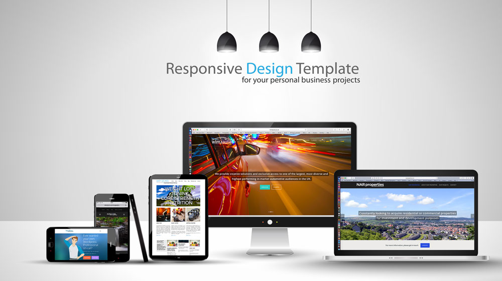

Simply put, a responsive theme is one that adjusts the way it displays content based upon the device being used to view it. This theme is responsive. The idea is to place a priority on making the content appear big and legible on all devices, particularly on smaller screens, but the reality is that this involves a trade-off with the layout. If you view this website on a mobile phone, a tablet and a desktop (or laptop) computer, you will notice that it looks quite different. Things that might normally be in 2 or 3 columns get shifted into on long column, sidebar content appears underneath the main body content, the navigation menu can be affected, and frequently other items like logos in the header can be adversely scaled to fit on smaller screens….that is responsive. If we turn that off, the site would look exactly the same, just a tiny, scaled-down version of the full sized website when viewed on a phone or tablet, and visitors would be left to zoom in and out to actually read the content.
As I say, it is a bit of a trade off! Whilst personal preferences will definitely factor into your decision to go responsive or non-responsive, the prevailing wisdom is that the benefits of responsive themes outweigh non-responsive themes. Aside from usability, responsive themes are considered mobile friendly and will therefore have positive SEO benefits.


